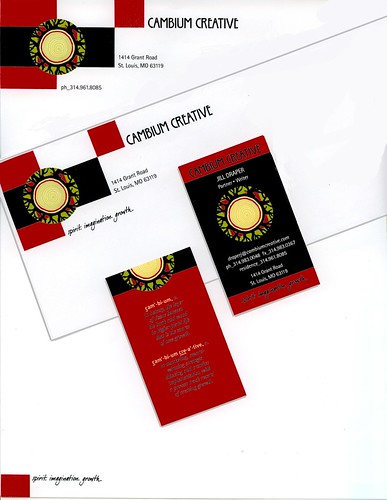
Jonathan is the art guy and I'm the writer, but I had started fooling around with PhotoFiltre, a free photoshop-like digital editing software and came up with the tree round showing the rings (remember, it's the cambium that creates those growth rings) and added a halo of branching limbs.
The circle within a square is a nice design element, but it's also a mandala, a symbol found in religious artwork in virtually every tradition. Jung says it's one of those symbols that resonates in the collective unconscious. In Hindu and Buddhist meditation, it's a "sacred circle" used to raise consciousness that represents the merging of male and female forces. Mandalas are found all over Europe in rose windows, labyrinths and mosaics. Can't hurt, now can it.
So while I designed the logo, Jonathan cleaned it all up and made it into what you see here. A lot of art directors would feel territorial, but Jonathan was as gracious and encouraging as he could be.
The back of the business cards read:
cam'-bi-um, n.
in botany, the layer
of tissue between
the bark and wood
in higher plant life
that is the source
of new growth.
cam'-bi-um cre-a'-tive, n.
in marketing, award-
winning strategic
thinking and creative
implementation with
a proven track record
of creating growth.
We like it, but what do you think? Any comments or suggestions are welcome.
